
New look, same Ohel
Issue of December 11, 2009/ 24 Kislev 5770
Ohel, at age 40 America’s largest Jewish social service agency, has gotten a facelift.
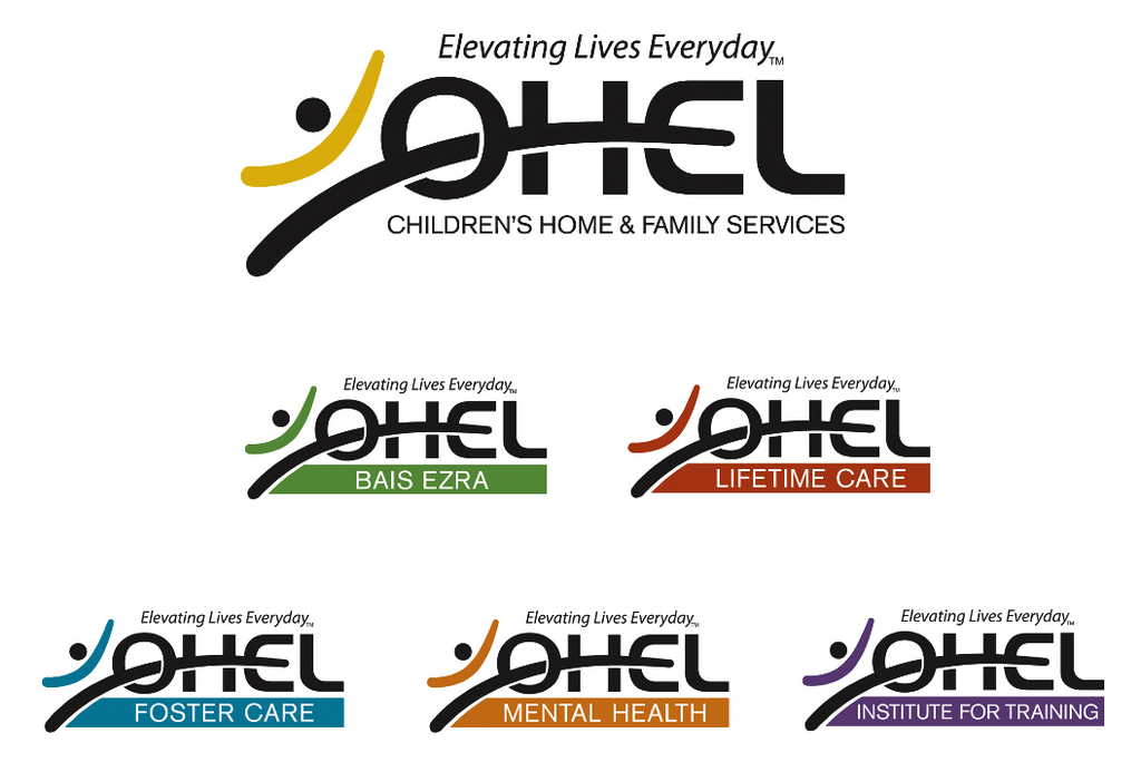
Formerly known as Ohel-Beis Ezra, Ohel has changed its logo and tagline. New ads feature a sleek re-branding of the organization and a new motto: “Elevating lives everyday.”
“There’s no question that the brand is a well-recognized brand in the community,” said Ohel’s director of communications, Derek Saker, “but it’s actually the association of what we do where there’s a disconnect. People know of Ohel but they inevitably associate it with foster care.” The new logo was designed by Red Rooster Designs, an Arkansas-based firm, and features a man “uplifting” himself to complete the word “Ohel.”
The new branding campaign, according to Saker, is an attempt to truly “articulate” what Ohel does.
“The organization does not treat only those in crisis or those facing a major disability, but also typical people, day-to-day people who are going through any number of challenges, whether marital issues, relationship issues or losing one’s job.”
The new branding features distinct colors for the different segments of the organization: Ohel Mental Health, Ohel Institute for Training, Ohel Foster Care, Ohel Lifetime Care, and Ohel Bais Ezra.
Aside from the two best-known areas of Ohel’s work, Saker described the other aspects of the organization. Ohel Mental Health works with individuals suffering from mental illnesses, both severe and minor. The Institute for Training organizes workshops and seminars throughout the year for educators and families of children with disabilities.
“The Lifetime Care Foundation...basically answers the question for kids with disabilities whose parents are moving on to the next world and [are] concerned what will happen,” to the children after the parents are gone, said Saker.
The new motto replaces “Everyone needs a family,” a change that reflects Ohel’s different areas of service, Saker said.
“Whether a woman is a victim of domestic violence, or an adult with a developmental disability... That’s what we do on a daily basis,” Saker explained. “We’re not an organization that provides one summer camp a year. We’re elevating lives every day.”
Elie Rosenfeld, CEO of Joseph Jacobs Advertising, praised the new look.
“The rounded Sans-serif type in the logo gives a much more contemporary, modern feel,” he said. “Color coding all those different divisions allows Ohel to be the overall umbrella yet gives an identity to each.”
Saker admitted that due to the financial climate, Ohel will not be do much advertising for the new branding, instead combining the effort with Ohel’s fortieth anniversary celebration.
“It never was going to be a billboard campaign like a rebranding of Nike.”
Perhaps taking a page from the venerable sneaker company, Ohel’s new logo does feature its own copyrighted swoosh.


